So you’ve decided to create a podcast. At this point, you’re probably making a mental checklist of everything you’ll need to bring it to life—your podcast name, the format, the right mic, editing software, the list goes on. While podcasts are primarily audio, there is one essential visual component: the podcast cover art.
This square image may be tiny, but its significance for your podcast is huge. It’s a key way to brand your podcast and attract the right audience, so it’s worth putting in some extra time and effort to get it right.
You don’t have to be a seasoned graphic designer to create polished podcast artwork—you only have to think like one. That means analyzing your podcast’s essence (subject matter, tone, target audience, and differentiators) before you even get started with the design process. Once you’re ready to put pen to paper, it’s time to get nerdy about details like fonts, colors, and white space. This guide shares how to do it.
What is podcast cover art and why is it important?
Podcast cover art is the little square image that appears next to a podcast’s title. Think of it as the album cover for your podcast. When potential listeners go browsing for a new podcast, the cover art is the first thing they see.
Ideally, your cover art will stick in your listeners’ minds—it’s your podcast’s visual identity. Think about iconic album covers like The Beatles’ Abbey Road with the image of the Fab Four strolling on a crosswalk. It’s the first thing many people remember about that album, even though it’s full of some of the band’s most famous songs. Your podcast cover art should make a similar first impression on listeners.
What to consider before designing your podcast cover art
Podcast genre and tone
The genre and tone of your podcast should be the guiding element for your cover art design. Think of it as a way for listeners to get an idea of what they can expect from your content.
Consider a few details:
- Color palette: Use colors that align with your podcast's mood. For example, a wellness podcast might use a bright, airy color palette, while a true crime podcast could opt for darker, more moody tones.
- Font selection: The typography you choose speaks volumes. Serif fonts like Times New Roman and Georgia suggest sophistication, which is perfect for professional or serious content. For comedic podcasts, consider more casual font styles like block or handwritten fonts.
Podcast audience
Different audiences have different preferences and expectations, which you need to take into account to make good podcast cover art. Think about:
- Demographics: Consider the age, gender, income level, and location of your audience. Are they urban dwellers or from rural areas? Are they experts or novices in the podcast topic? Certain design elements will appeal to some of them more than others. Cover art for a podcast aimed at college students isn’t going to have the same look and feel as for a podcast for fans of classic rock.
- Visual appeal: While avoiding stereotypes, think about what visual elements might attract your specific audience. For instance, men might prefer darker tones, while women could be drawn to brighter colors. Take Call Her Daddy and the Lex Friedman Podcast as prime examples.
 |
Your unique selling points
Your podcast should have features and selling points that other shows don’t. Use them to your advantage in your cover image.
- Relevant imagery: For a podcast about famous trials, incorporate elements like Lady Justice. For a nature-themed show, wildlife imagery would be fitting.
- Specificity matters: If your podcast has a niche focus—for example, women in film—make sure the cover art captures these specific themes. Remember, the goal is for potential listeners to grasp the essence of your podcast at first glance.
- Special features: If your podcast has unique aspects (like celebrity hosts), highlight these in your cover image. Armchair Expert with Dax Shepard and Conan O’Brien Needs a Friend both use the hosts’ images prominently.
 |
10 tips for designing a captivating podcast cover art
- Make sure it works at a tiny size
- Don’t overcrowd your art
- Choose fonts carefully
- Use color to your advantage
- Consider adaptability
- Create eye-catching images
- Optimize for mobile users
- Consider including social proof
- Limit your text
- Integrate branding elements
1. Make sure it works at a tiny size
Most listeners first see your podcast as a small icon on platforms like Apple Podcasts or Spotify. That’s even if they’re viewing it on a computer—seeing it on a phone screen, the way most listeners do, makes it even tinier. Your podcast cover art needs to be visible even when it's scaled down to thumbnail size.
Test your design by scaling it down to around 55 x 55 pixels as a JPG file. Make sure key elements like your title or podcast logo design are easy to read. Stay away from overly intricate fonts and details that might get lost when the image is reduced. Instead, use bold, simple shapes or high-contrast color schemes. It’s a great way to make sure the elements of your design remain visible and striking, even when viewed on a smaller scale.
Test the design on different devices to ensure it maintains its impact. Here are a few examples from Spotify’s Podcast Charts, which shows how small podcast cover art can get.
Notice which elements stand out at this size. Simple art with bold text, like Mortal Sin and This Past Weekend, are easy to read, while more complex images like New Heights and What Now? with Trevor Noah contain details that are hard to parse at this small scale.
 |
2. Don’t overcrowd your art
Simplicity is key in podcast cover art design. Crowded or busy artwork can be off-putting and confusing. Instead, focus on one or two central elements, such as striking images or bold text.
By taking a minimalist approach and using just a few elements that showcase the essence of your podcast, you’ll make a stronger impact than trying to include too many elements.
Prioritize the most important element of your brand—this could be a unique symbol, your podcast title, or a striking image. Design around this focal point by using negative space to highlight it without adding unnecessary clutter. A great example of using negative space and fewer elements as a way to stand out while still staying on brand is The Daily by The New York Times.
 |
3. Choose fonts carefully
Font choice significantly impacts the legibility and mood of your cover art, so choose one that reflects your podcast’s tone. You also want to make sure your font is legible at small sizes and doesn't clash with the background.
There are five general classifications of typefaces:
- Serif
- Sans serif
- Script
- Monospaced
- Display
Script and display typefaces are best for headlines. For a professional look, consider a clean, sans-serif font. If your podcast has a more playful or creative theme, you might opt for a unique, decorative font that’s more ornate. Experiment with different font weights and styles to see what complements your design best.
Consider how your font choice works not just in isolation, but as part of the overall cover design. Keep the number of font types you use to a minimum—two at most—and make sure your font is legible at small sizes.
 |
4. Use color to your advantage
Colors convey mood and grab attention. Choose a color palette that reflects the tone of your podcast and stands out. Bold, contrasting colors can make your cover pop, while a more subdued palette might suit serious or professional topics.
Test your color scheme in different lighting conditions and on several different screens—colors can appear differently on screens versus printed materials.
Finally, keep color psychology in mind. Blues can evoke trust, while reds can signal excitement or urgency. To help you choose which color combination would work best, use a free color palette creator tool like Coolors.
 |
5. Consider adaptability
Your podcast cover art needs to look good wherever it shows up. Beyond podcast directories, think about how it’ll look on social media platforms, websites, or even printed materials like business cards. A versatile cover that maintains its integrity across different sizes and formats is key.
Create a base design that can be easily adapted or resized. This might involve having a central logo or image that can be used across different mediums without losing its essence or appeal. You can do this by creating a vector image with tools like Photoshop but other free options, like Canva, can work just as well.
6. Create eye-catching imagery
A unique, memorable image can set your podcast apart in a crowded market. Use imagery that instantly grabs attention and hints at your podcast's content. This could be a symbolic illustration, a photograph, or abstract art that is relevant and resonates with your target audience. Any image should be high-quality and not pixelated.
Most importantly, choose imagery that tells a story or creates curiosity. It should evoke a reaction or emotion that compels the viewer to learn more about your podcast. How to Keep Time is a great example of podcast cover art that catches the eye, sparks curiosity, and sets a tone while remaining on brand.
 |
7. Optimize for mobile users
About 73% of weekly listeners tune into podcasts on their smartphones, according to Edison Research. Your cover art needs to look great on small screens. This means bold, clear elements and readable text.
Regularly check your podcast cover on different mobile devices and apps to make sure it looks great in the environments where your audience is most likely to see it.
8. Consider including social proof
If your podcast has accolades, notable guests, or is part of a respected network, consider including this in your cover art—but do it subtly. This could be a small logo or a tagline. This type of social proof lends credibility and intrigue, which encourages new listeners to give your podcast a try.
Balance social proof elements with the overall design. They should enhance credibility without overpowering the main design elements. Play with sizing to make sure these additional elements don’t interfere with the rest of your design.
For an example, check out the podcast art for Free from Desire, which won an award at the Tribeca Festival and includes the festival’s telltale laurel leaves in one corner of the design.
 |
9. Limit your text
Too much text can make your cover look cluttered and hard to read, especially at smaller sizes. Choose a clear, legible font, keep word count to a minimum, and take a less-is-more approach. This means sticking to essential information:
- Your podcast's title
- Any social proof elements or logos
- A short tagline, if relevant
- Podcast host names, if they’re a draw
The title should be the most prominent text element. If you include a tagline, be sure it complements rather than competes with your main title. On Purpose by Jay Shetty is a prime example of not overdoing it while still including key design elements like a logo, host name, host image, and podcast title.
But consider which elements will draw people in, and don’t feel pressured to include any that won’t. Jay Shetty is a famous personality with millions of followers, so it makes sense to include his name on the logo. But if your podcast’s host doesn’t have much name recognition, there’s no need to take up space with their name. You can always add it later when the podcast makes it big.
 |
10. Integrate branding elements
Branding relies on consistency. Because of that, consider including elements from your podcast's overall branding in your cover art, such as specific colors, fonts, or logo designs. It will create a professional look that builds brand recognition and loyalty among your audience.
Even better: develop a cohesive brand style guide to stay consistent in all your podcast branding materials. It can include specific color codes, font names, and usage guidelines for logos or other imagery so that when someone comes into contact with your content, they can immediately recognize that it came from you.
Podcast directory requirements for cover art
When you publish your show on your podcast hosting platform, it’ll auto-populate on all sorts of listening apps including Spotify and Apple Podcasts. That means that when you create your podcast cover art, it’s crucial to make sure you meet the specifications for each podcast directory you’ll show up on.
Fortunately, most platforms have similar requirements, so if you create a square 3000 x 3000 pixel JPEG or PNG image of your art, you’ll be set. Check out the detailed specifications for the top platforms.
Spotify
An app with more than 180 million premium subscribers worldwide and 32.5 million yearly podcast listeners, Spotify is the most popular podcast directory out there. If you’re promoting your podcast there, make sure your show meets Spotify’s cover art requirements:
- File type: TIFF, PNG, or JPEG format
- Resolution: The highest resolution available
- Size: At least 2400 x 2400 pixels
- Aspect ratio: 1:1
Apple Podcasts
Coming in at a close second, Apple Podcasts (formerly known as iTunes) has 28.8 million podcast listeners per year. Apple’s cover art requirements include the following:
- File type: JPEG or PNG
- Size: 1400 x 1400 pixels to 3000 x 3000 pixels (the largest size is preferred)
- Aspect ratio: 1:1
Resources and tools for making the best podcast cover art
Here are some top tools and resources to help you design an outstanding podcast cover image.
1. Canva
Canva is a free design tool used by podcasters for creating all kinds of branded visual content. Its drag-and-drop dashboard and wide range of free templates make it simple to design a podcast logo or cover art that's both professional and high-quality.
2. The Podcast Design Company
If you’d rather outsource your cover art design, The Podcast Design Company specializes in cover design. They understand the importance of creating an album cover or podcast logo that captures the essence of your show. Once you hire their professional designers, they’ll create custom artwork that stands out.
3. 99designs
99designs is another excellent resource where you can find talented designers for your podcast artwork. Whether you're looking for a minimalist design, retro lettering, or a bold, eye-catching logo, 99designs connects you with professional designers who can bring your vision to life.
Do more with Descript
To recap, your podcast cover design should ideally be in a square format, typically a 1:1 ratio, and saved as a high-quality JPEG or PNG file. That way, your covert art is visible to anyone, especially those on mobile devices where most listeners discover new podcasts.
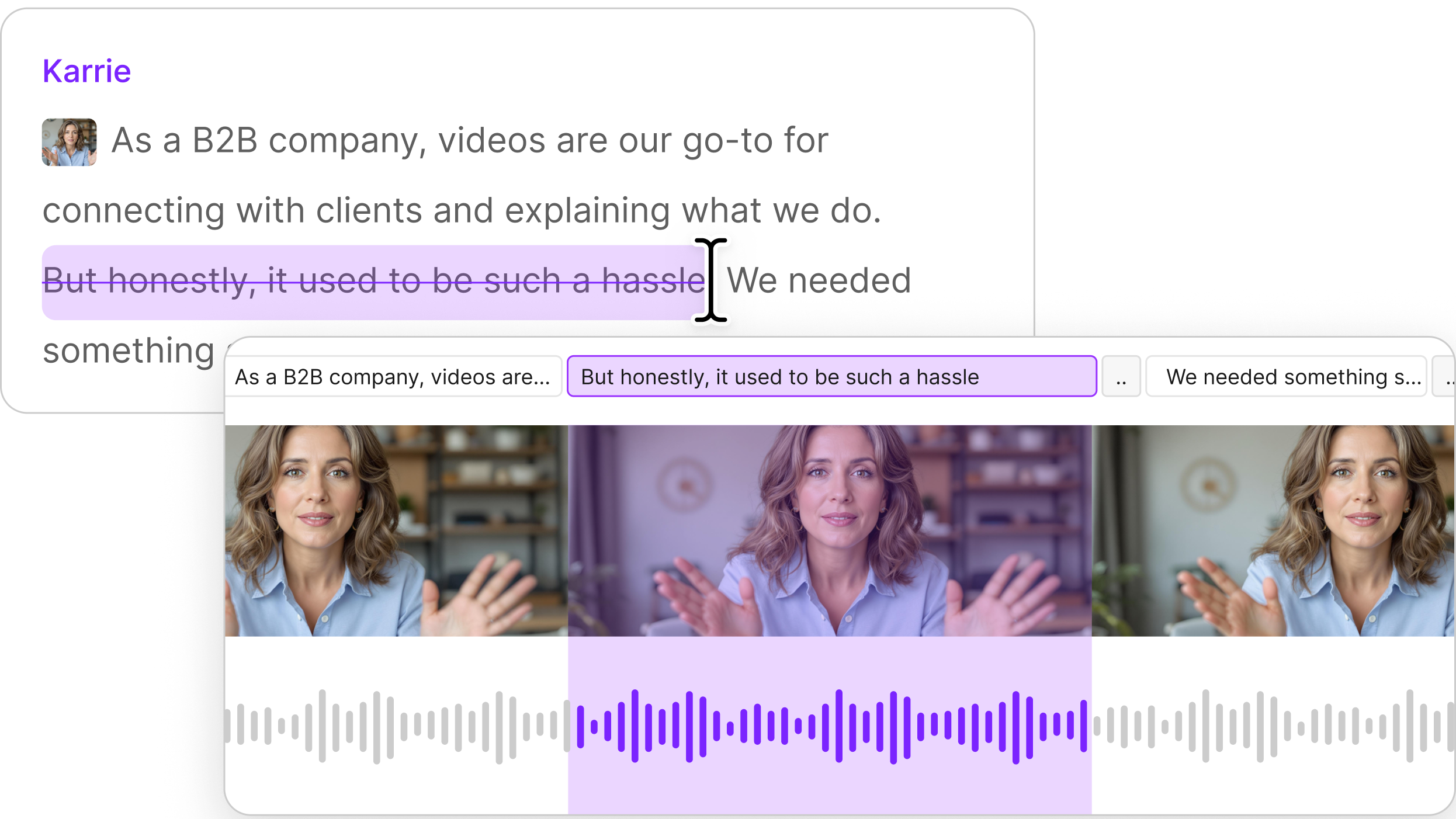
With the visual component down, the last thing to do is make sure your audio is up to par. For that, there’s Descript’s podcast editing software. It allows you to:
- Fix audio mistakes by cloning your voice with AI
- Remove background noise with Studio Sound
- Add seamless transitions between podcast scenes
- Make your show more accessible with automated transcriptions
- Create social media snippets, including waveforms and subtitles, to promote your podcast online
Get started with Descript today and see why thousands of podcasters rely on its audio editing tools.